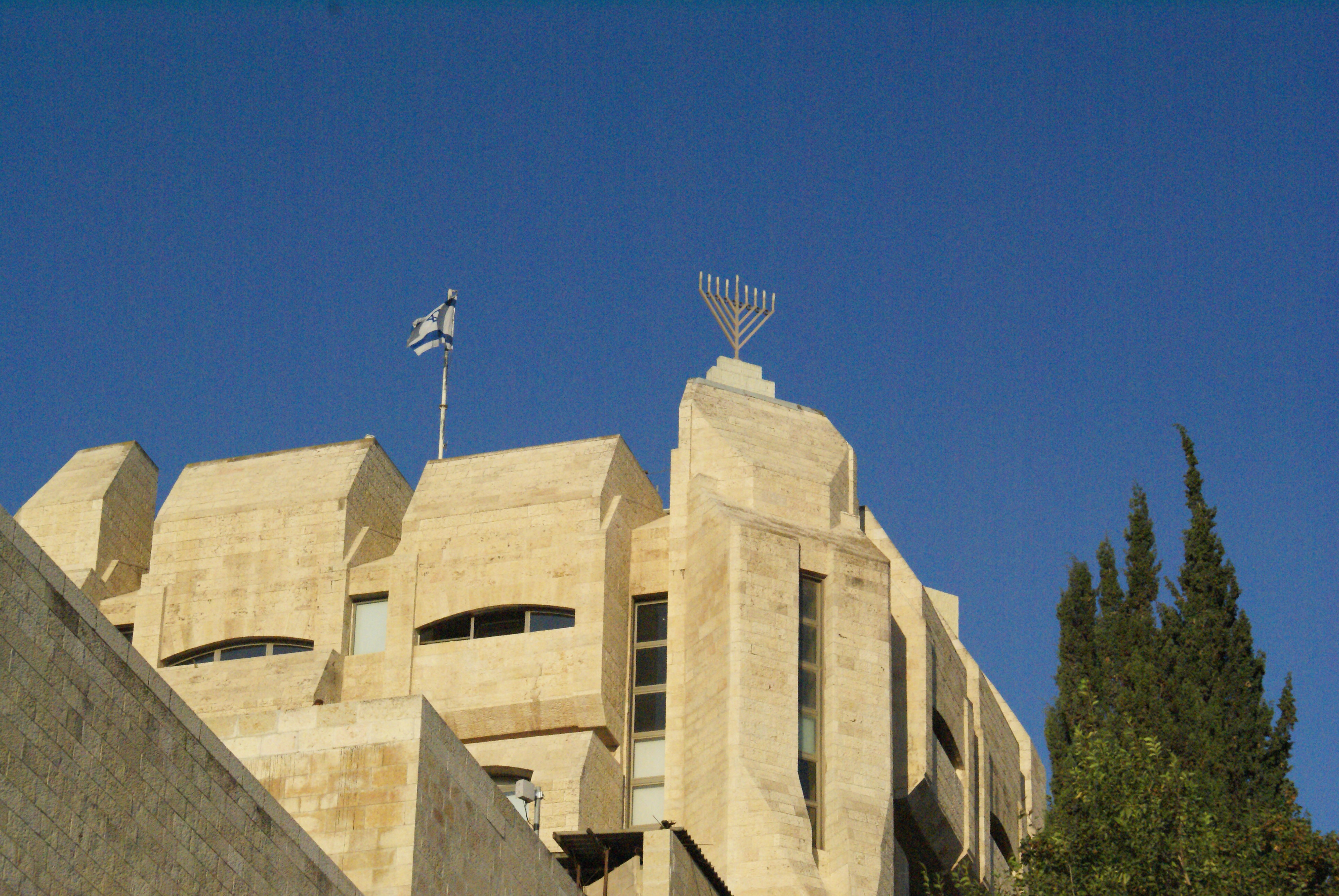
I had the best experience studying at one of the most iconic buildings in Israel, nestled in one of the most stunning places in the world. I absolutely adored Yeshivat HaKotel, but I do think that the Yeshiva branding could be better. Take a look at the logo they are using:

I don't think this is great. The photo won't work well in big sizes, and the text is hard to read and there's too much of it. The composition isn't appealing, and overall, there's a lot of room for improvement.
I suggested a new logo that could serve as the foundation for a complete rebranding of the Yeshiva.

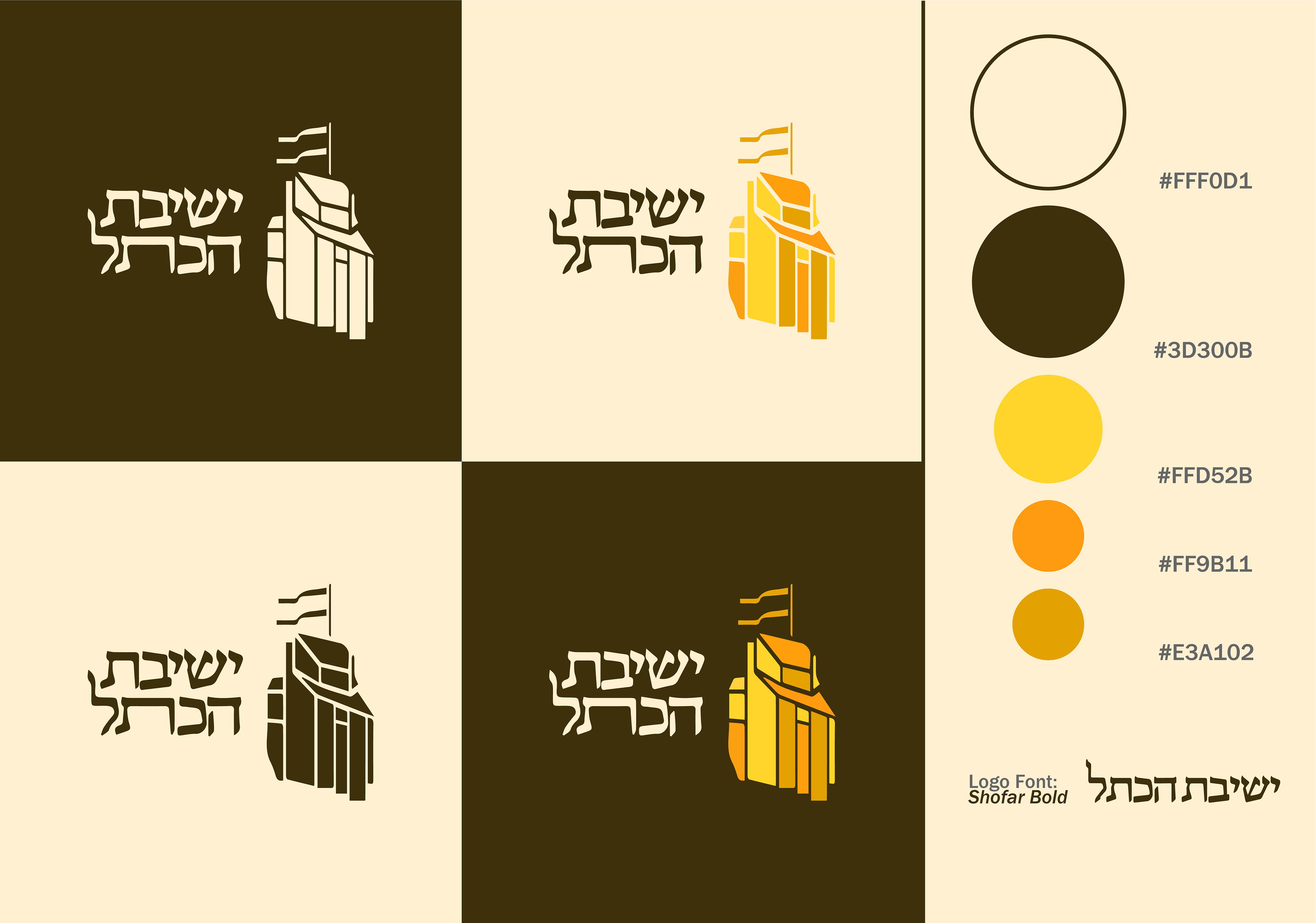
I carefully selected traditional typography to convey the idea that we are intricately connected to a lineage that extends across generations. Drawing inspiration from the old logo, which prominently features the iconic yeshiva building nestled in the heart of the Jewish quarter in the Old City of Jerusalem, I sought to honor the rich heritage and significance of our institution. The chosen colors are intended to capture the essence of Jerusalem, radiating a golden hue that reflects the city's timeless allure, while also infusing vibrancy reminiscent of the spirited atmosphere among the young students at the yeshiva.